Plot.ly in Dataiku DSS Web App
Dataiku DSS and Plot.ly JS (Plot.ly in DSS WebAPP)
What is Plot.ly JS?
Plot.ly is a high-level charting library, Plot.ly JS built on top of D3.js. It ships with 20 chart types, like a basic charts (e.g. line, bar, scatter, pie, heat maps) as well as 3D charts and SVG maps.
Charts are described declaratively as JSON objects and are shipped with zoom, pan, hover, and click interactions (Click-and-drag to zoom into a region, double-click to autoscale, click on legend items to toggle traces).
Plot.ly JS was open sourced late last year and it can be used in Javascript, Python (e.g. Jupyer notebook) and R packages, this makes it easily to integrate Plot.ly with Dataiku DSS.
The main advantage of Plot.ly is that it is very quick and easy to create interactive charts.
Table of Contents
What is Dataiku DSS Web App?


DSS web app is a tool for sharing your insights. Using a web application, we can represent the data on the dashboards from the Dataiku datasets using a variety of Javascript libraries and DSS has several built-in libraries (D3, jQuery, NVD3…)
The web app editor is divided into 2 parts, with 4 main panels in each – HTML, CSS, JS, and Python code editor.
The editor is interactive. Changes in any one of the panes will result in an update on the left after saving the changes.
In addition to the built-in JS libraries, we can install third-party libraries, such as Plot.ly JS.
Create new Dataiku Web App


Open an existing project. Go to Dashboard tab and select Insights
Create new empty web app
Step 1: Setup plot.ly JS
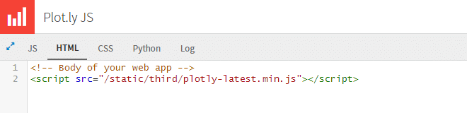
To install the Plot.ly library we can use CDN, just add <script src=”https://cdn.plot.ly/plotly-latest.min.js”></script> right after <body> tag.
Or we can download the Plot.ly JS library and place it into dataiku frontend folder.
Frontend dir is the dir from where you perform installation. (e.g. ~/dataiku-dss-2.3.0/frontend/static/third/ ) and add
<script src=”/static/third/plotly-latest.min.js”></script> right after <body> tag.
Step 2: Create basic bar chart
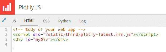
To create a basic chart using Plot.ly we need to create <div> object which will contain our plot:
Add <div id=”myDiv”></div> to HTML tab
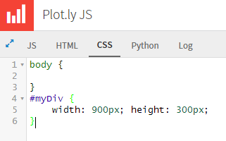
Also setup size for our plot, add following to CSs tab:
|
1 2 3 |
#myDiv { width: 900px; height: 300px; } |
Next we need the data to plot. We will use the Dataiku JS API to fetch data from Dataiku Dataset.
First, we need to decide how many rows we want to get from the dataset. Add one of the following code snippets to the JS tab of our Web App:
|
1 2 3 4 |
// dataset options (get full dataset) var options = { sampling: 'full' }; |
|
1 2 3 4 5 |
// dataset options (get first 15k rows) var options = { sampling: 'head', limit : 15000 }; |
|
1 2 3 4 5 |
// dataset options (get 10% of rows) var options = { sampling: 'head', ration: 0.1 }; |
|
1 2 3 4 5 |
// dataset options (get random 15k rows) var options = { sampling: 'random', limit : 15000 }; |
The size of the data determines fetch performance.
Often we need only a couple of columns from the dataset. We can define these in dataset options. It improves performance.
|
1 2 3 4 |
var options = { sampling: 'full', columns : ["ymdate", "failed_searches"] }; |
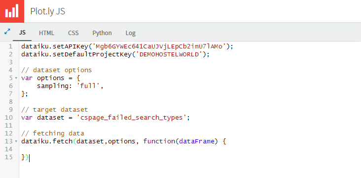
Add variable with target dataset name
|
1 |
var dataset = 'cspage_failed_search_types'; |

Don’t foget to authorize web app for using selected dataset. Click to the “Settings” button on the right top corner and select all read permissions to selected dataset.
To fetch data from dataset we use dataiku.fetch method which can take up to 4 arguments.
We saw nice performance
We can easily get 20k rows from dataset or even more…
On the screenshot below we take all columns and all rows from dataset cspage_failed_search_types;
Inside the success function of fetch method we must parse out data to Plot.ly format.
Main Plot.ly method is newPlot which takes 4 parameters: GraphDiv name, Data array, Layout settings object. (You can hide the link to Plotly’s cloud with {showLink: false} as the 4th argument.
Plotly.plot(divid, data, layout, {showLink: false})). The mandatory are only 2 of them, graph div and data.
All available attributes for data and layout objects you can find here you can find here.
|
1 2 3 4 5 6 7 8 9 10 11 12 13 14 15 16 17 18 19 20 21 22 23 24 25 26 |
// fetching data dataiku.fetch(dataset,options, function(dataFrame) { // creating object `bar_trace` // with minimal count of attributes (type,x,y) var bar_trace = { type: 'bar', x: [], y: [] }; // map records dataFrame.mapRecords(function(r){ // parse and format date (x) var dateString = r.ymdate; var year = dateString.substring(0,4); var month = dateString.substring(4,6); var day = dateString.substring(6,8); var x = new Date(year, month-1, day); // append date to X axis bar_trace["x"].push(x) // append value to Y axis var y = r.failed_searches; bar_trace["y"].push(y) }) // draw plot Plotly.newPlot('myDiv', [bar_trace]); }) |

Here we’re parsing column ymdate from yyyymmdd string to the Date object.
And this is how the default bar chart looks.
Step 3: Publishing to a dashboard


After creating our web app we can easily publish it to a dashboard by clicking Publish in the web app editor
Our web app will be shown on the dashboard, and app will be loading data every time you load the dashboard, so if you change the input data, the changes will be reflected immediately.
Also on the dashboard you can use the native Plot.ly control features as zoom or selection on chart.