Exploding polygons in Snowflake. KaBooom! Visualising Dublin property data in Tableau.
Use Flexter to turn XML and JSON into Valuable Insights
- 100% Automation
- 0% Coding
Introduction
In this blog post we will show the power of Snowflake UDFs to prepare data for visualisation in Tableau. We take the Irish Census Data from the Central Statistics Office of Ireland and use Snowflake to prepare the dataset for visualization in Tableau.
As we have already loaded and pre-processed the Irish Census dataset for this blogpost we are not going to cover that part of the process. Rather we will focus on how Snowflake can be used to transform the data for data visualization tools.
Dataset
Our specific dataset contains small areas in Dublin (a small area consists of 100 or more dwellings) along with their polygon definitions.
As data is already loaded in a table in a Snowflake database, we can use the new Worksheet User Interface from Snowflake to easily preview the data: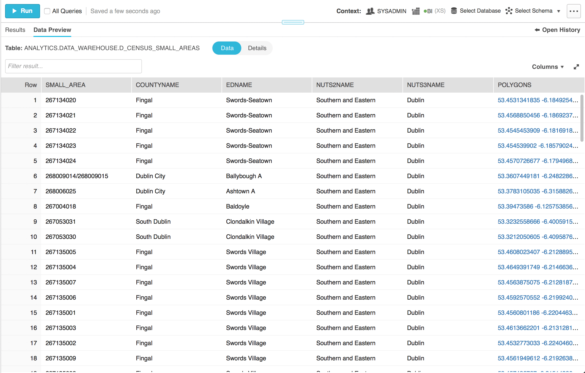
You can see that we have a lot of information in this dataset. We will mainly focus on the Polygons column. It contains the nodes of the polygon as latitude and longitude pairs in proper sequential order. As the values of Polygon column are long texts, we can preview their full value easily with Snowflake Web UI by clicking on them: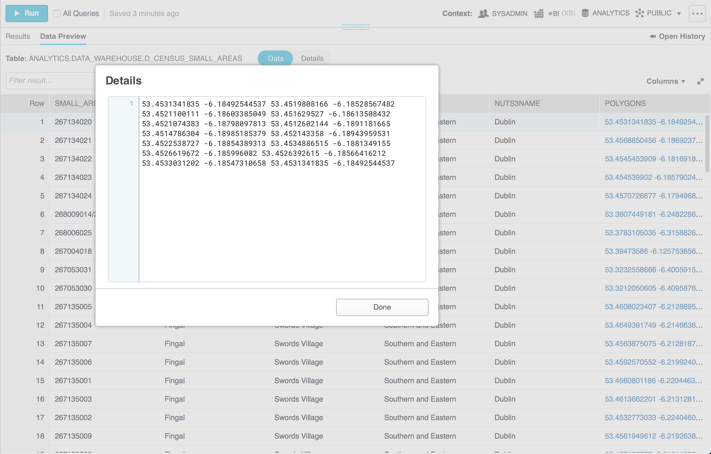
As you can see the polygon of a row is a long string of latitudes and longitudes. In this case we have 12 latitude/longitude pairs.
You can use Tableau to show custom Polygons on a map. However, they need to be in a certain format. Each node of the Polygon needs to be on a separate row with a sequence number. For this reason we want to expand the string of Polygon nodes into multiple rows where each row will have three columns – Latitude, Longitude and SequenceId.
So the first row we output will be from the first latitude/longitude pair and have a sequence id of 1, second row will contain the second pair and have a sequence id of 2 and so on.
UDFs to rescue
The easiest way to solve this technical problem in Snowflake is using Javascript UDFs.
The following UDF performs the functionality we need:
|
1 2 3 4 5 6 7 8 9 10 11 12 13 14 15 16 17 18 |
CREATE OR REPLACE FUNCTION explodepolygons(polygon string) RETURNS TABLE (lat string, long string, sequence_id double) LANGUAGE javascript AS '{ processRow: function (row, rowWriter) { polygon_array = row.POLYGON.split(" ") var i; var sequenceId = 1 for (i = 0; i < polygon_array.length; i+=2) { rowWriter.writeRow({LAT: polygon_array[i], LONG: polygon_array[i + 1], SEQUENCE_ID: sequenceId}); sequenceId += 1; } }, finalize: function (rowWriter, i) { }, initialize: function() { } }'; |
The UDF takes as input a column named polygon of type string. This is a JavaScript datatype but it’s equivalent to the varchar column datatype found in databases.
The UDF returns a table with three columns – latitude, longitude and sequence_id.
In Snowflake we can create a User Defined Function by making an object with three functions (we explained this in more depth in this blogpost).
For our use case we need to define only the processRow function. This function receives as input every row from the polygon column.
In the function we create an array (a list) by splitting the string of key value pairs based on whitespace. Since latitude is at odd positions in that array and longitude is at even positions, we can simply iterate over the array and output a row by pairing together the latitude/longitude pairs along with their order in the sequence. The actual output is done using the rowWriter.writeRow function call.
Applying the UDF
To provide the dataset to Tableau users, we can create a view or a new table made by applying the UDF we defined on the original table.
Let’s see the specific syntax for applying it and also the result.
The following SQL will create a new table and apply the UDF to explode the table:
|
1 2 3 4 5 6 7 8 9 10 11 12 |
CREATE OR REPLACE TABLE Analytics.data_warehouse.processed_d_census_small_areas as SELECT SMALL_AREA, COUNTYNAME, EDNAME, NUTS2NAME, NUTS3NAME, LAT, LONG, SEQUENCE_ID FROM Analytics.data_warehouse.d_census_small_areas, TABLE(explodepolygons(polygons)); |
The data in this table looks as follows: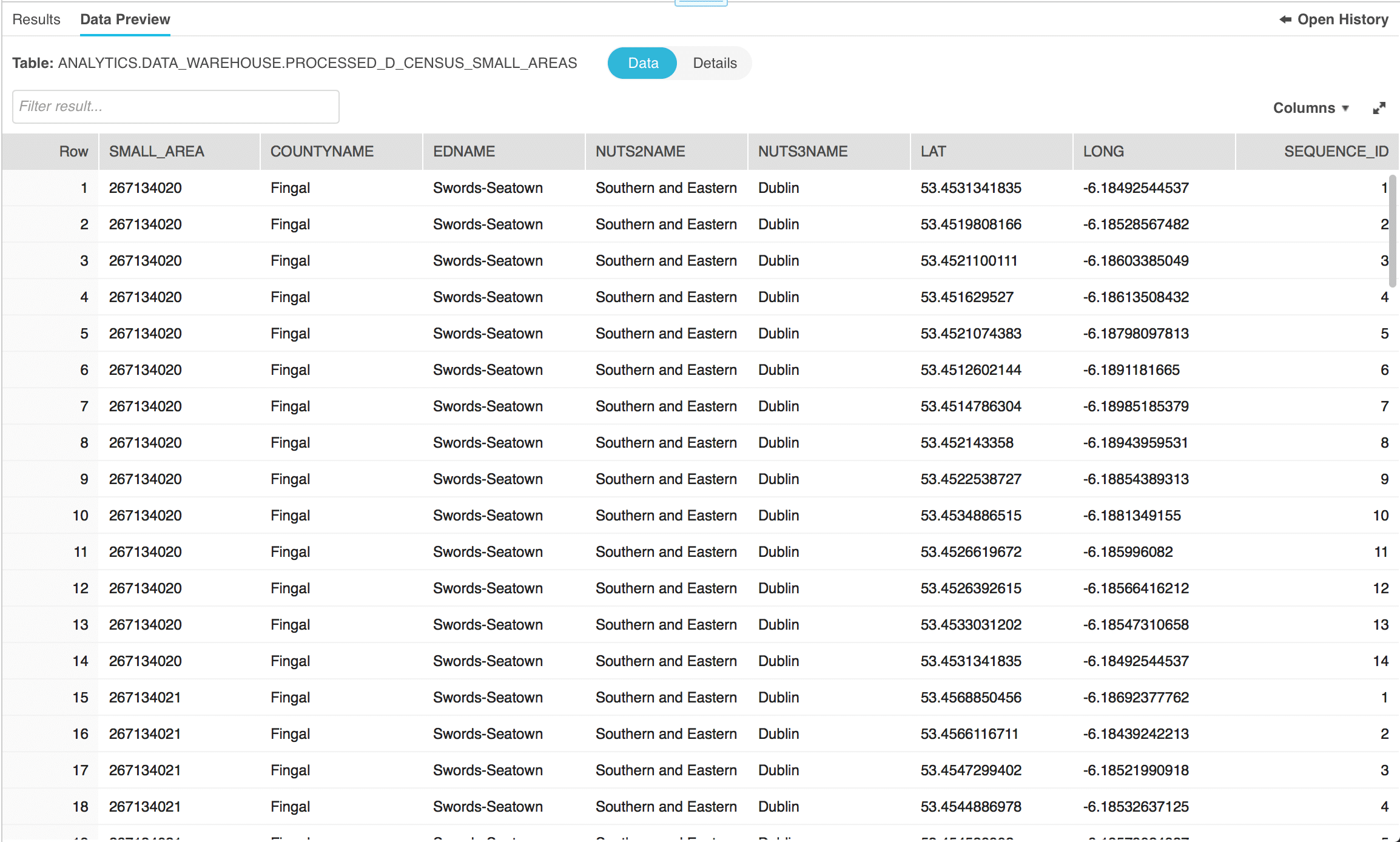
You can observe the additional columns we generated with our UDF – LAT (latitude), LONG (longitued) and SEQUENCE_ID. You can also observe how the row we previewed was split into 14 rows as expected.
Visualising Polygons in Tableau
All that remains to be done is to visualise the data in Tableau.
Here is a map of Dublin with the various small areas.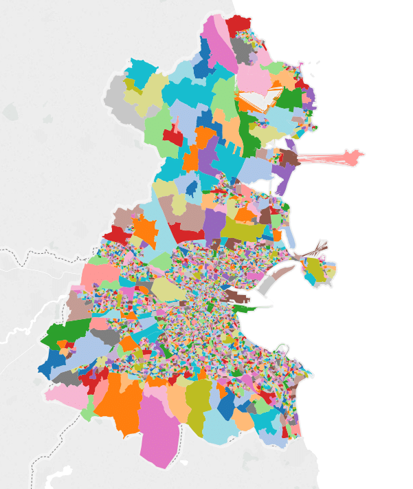
Here is another map that visualises the average house prices (obtained from property register website) by small area. The darker the higher the average house price.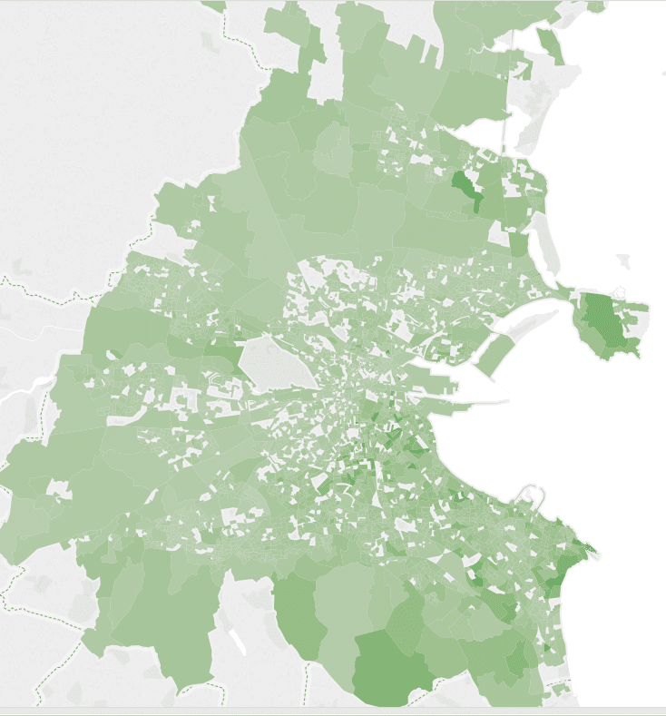
Enjoyed this post? Have a look at the other posts on our blog.
Contact us for Snowflake professional services.
We created the content in partnership with Snowflake.


