SQL Visualisation Guide – Query Diagrams, Lineage & ERD
Have you ever inherited the SQL codebase from someone else where it is in a “bit of a mess”? 😁
- Where you find nested CTEs (Common Table Expressions), stacked like Russian dolls.
- Where the joins are crossing relentlessly between tables like tangled vines, pointing back on themselves in recursive loops that no one ever intended to untangle.
- Where the same joins lead to database views, only to reveal that those views contain… yet more views. Each layer sinks deeper into a quagmire of cryptic, badly named aliases and obscure logic. Each time you think you figured out one view, another one pops up like a jack in a box.
- Where every time you make a fix, something else gets unfixed.
- Where the SQL code feels alive laughing at your attempts to bring order to the chaos.

Sound familiar? Most data engineers and SQL developers have been there including myself—staring at a spaghetti-like web of queries, trying to untangle a chaotic SQL codebase. It’s a common nightmare. Traditionally, you had to fight your way through the mess with pen and paper, manually drawing relationships, or running one inline view at a time, commenting and uncommenting joins just to make sense of the madness.
SQL Visualisers can bring structure to the chaos of complex SQL code by offering graphical representations of queries, views, CTEs, tables, and their relationships, which are much easier to understand than raw code. They do not replace the code but complement it.
I’ll dive deep into visualising SQL in this post. Before diving into the details, it’s important to clarify what “visualising SQL” means, as it can vary depending on the context and your goals.
I have come across the following interpretations for the terms visualising SQL and SQL visualisation as part of the research for this blog post :
- Visualising SQL code in a diagram (Data Query Language, DQL)
- Visualising dependencies in a data pipeline as part of SQL data lineage
- Visually building SQL queries (drag and drop)
- Creating logical and physical data flow diagrams
- Visually tracing and trailing data through an SQL query
- Visualising SQL joins in a query as Venn diagrams
- Parsing and representing the AST (abstract syntax tree) hierarchy of a query
- Visualising the output of an SQL query in charts, graphs, and dashboards
- Visualising database schemas, tables, and views in ER diagrams
I will break down the different types and approaches to visualising SQL, covering their meaning, use cases, examples, and tools. While I’ll touch on all types of SQL visualisation, I’ll focus on visualising SQL query code, explaining its benefits and exploring the various methods and tools available.
In a hurry? Here are the key takeaways.
Key takeaways
The concept of SQL visualisation can mean many different things. Here are 8 distinct types of SQL visualisations:
- Visualising the SQL query code itself.
- Displaying SQL data lineage to track data flow.
- Using visual tools to build SQL queries.
- Visual aids for learning SQL.
- Showing SQL joins as diagrams.
- Visualising SQL parse trees (representing query structure).
- Displaying SQL results as charts and dashboards.
- Creating visual ER diagrams from SQL or DDL code.
Each approach helps different users understand and interact with SQL in various ways.
In this post we focus on visualising SQL query code.
SQL, while seemingly simple, can lead to highly complex queries that are hard to read and maintain. Visualising SQL queries can make it easier to interpret and debug complex code.
As AI-generated SQL queries become more prevalent, tools for visualising SQL can play a crucial role in helping users review these automatically generated queries.
There are different ways to visualise SQL code depending on what you want to highlight:
- Focus on query intent: This method shows the main goal of the query, making it easier to understand without getting lost in technical details.
- Focus on syntax: This approach visualizes the specific structure and syntax of the SQL code, showing how the query is built step by step.
SQL to text is another way to explain SQL code. Instead of using visuals, it describes the purpose and logic of a query in words. This method complements visual SQL representations by offering a textual explanation of what the query does.
A tool that automatically visualises SQL query code is an SQL Visualiser.
Use Flexter to turn XML and JSON into Valuable Insights
- 100% Automation
- 0% Coding
What exactly Is SQL Visualisation?
I’ve uncovered nine distinct categories when it comes to visualising SQL, each with its own unique focus and benefits. Let me break them down for you, covering the meaning behind each approach, the use cases where they shine, real-world examples, and the tools that bring them to life.
Visualising SQL Query Code in a Diagram
I will cover this topic in depth in three separate sections further down in this blog post :
Here is a quick overview to get you started.
What it means
Visualising SQL transforms SQL code into a visual diagram. SQL queries are inherently structured hierarchically, resembling a tree, and can be graphically represented as a graph or flowchart. The visualisation helps to simplify complex SQL queries by breaking them down into easily understandable components.
A picture is often worth a thousand words
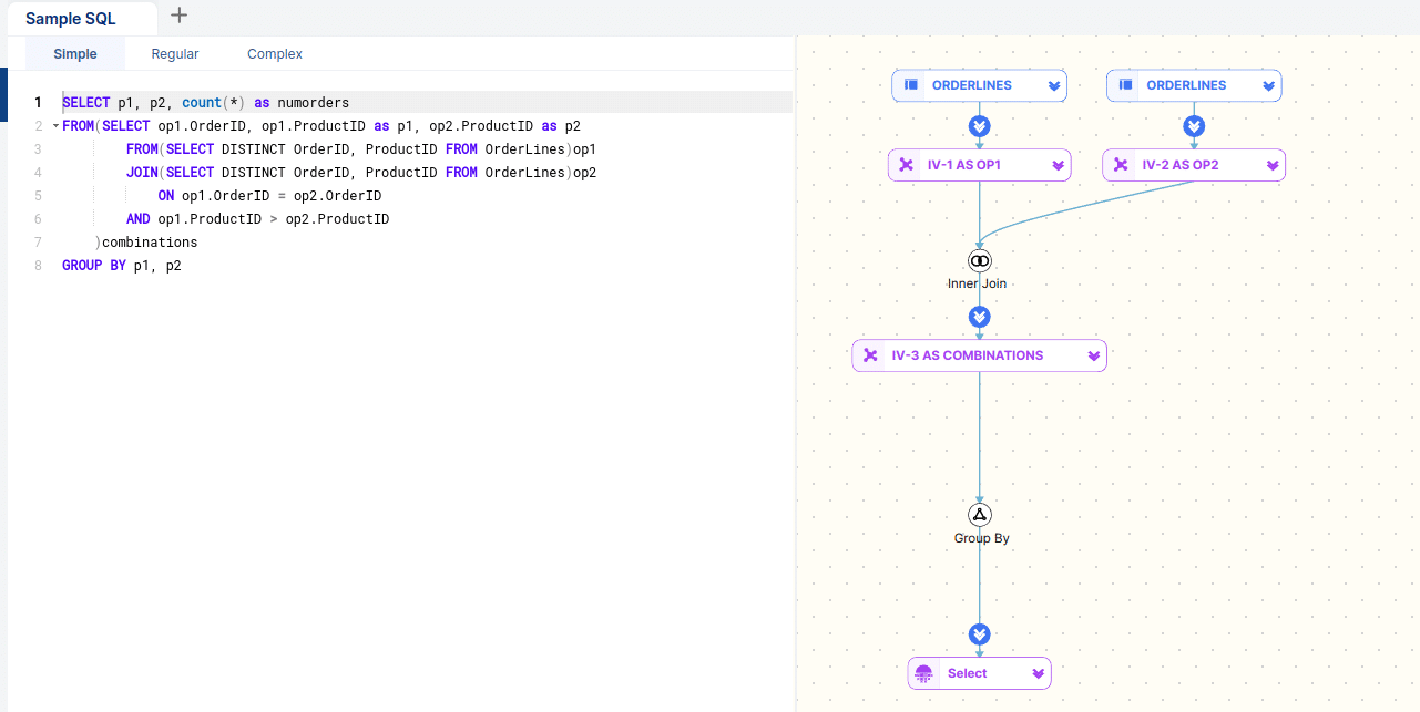
Visualising SQL code: query diagram
Example
Imagine you have a query joining multiple tables, inline views, subqueries, database views, and CTEs. Instead of reading through the SQL code, the visualisation shows each table and view as boxes (nodes). The lines (edges) connecting them with the SQL Operators (nodes) represent dependencies.
Use Case
The goal of query visualisation is to help users more quickly understand the intent of a query, as well as its relational query pattern. This is typically done for a single query to better understand how a query is structured hierarchically, e.g. nested inline views and CTEs. It also shows how data sets are related without diving into the code itself. The visual representations of SQL code provide a clear and intuitive way to understand SQL code, making it easier to grasp both the logic and the data relationships within complex queries. This can be particularly helpful for debugging, optimising performance, or explaining the query to others.
Tool
Using an SQL query visualisation tool you can visualise SQL code in a flow diagram. FlowHigh SQL Visualiser visualises both data sets and SQL Operators as nodes and uses arrows to describe dependencies. I have included a detailed review of FlowHigh at the end of this post
Visualising data lineage from SQL query
Data lineage from an individual SQL query focuses on understanding the structure, logic, and relationships within a single query, such as joins, filters, and aggregations. We have looked at this in the section about Visualising SQL query code.
Visualising Data lineage in SQL looks at the bigger picture. It focuses on visualising dependencies in a data pipeline on mapping the flow and interconnections between multiple SQL operations across different stages and layers.
What it means
In the context of data lineage of SQL, visualising dependencies refers to mapping the relationships and connections between different SQL operations—such as queries, updates, transformations, and aggregations—within a larger data pipeline. A data pipeline consists of multiple stages where data is extracted, transformed, and loaded (ETL) or where various queries interact with the data in different stages, and these stages depend on each other to deliver the final outcome.
SQL lineage visualisation provides a clear picture of how data flows through each step, allowing you to trace the source of data, its transformation, and where it is eventually stored or used. The visualisation often takes the form of a flow chart or graph, where each box represents a data set or data flow ( SQL operation). The arrows represent how data is passed between data sets and operations and define the dependencies.
Example
Suppose you have a data pipeline that processes sales data:
- Step 1: A query extracts raw data from several source tables.
- Step 2: This data is transformed by joining with a table of customer details.
- Step 3: Another query aggregates the results by region and creates summary tables.
- Step 4: The final query formats the output for reporting.
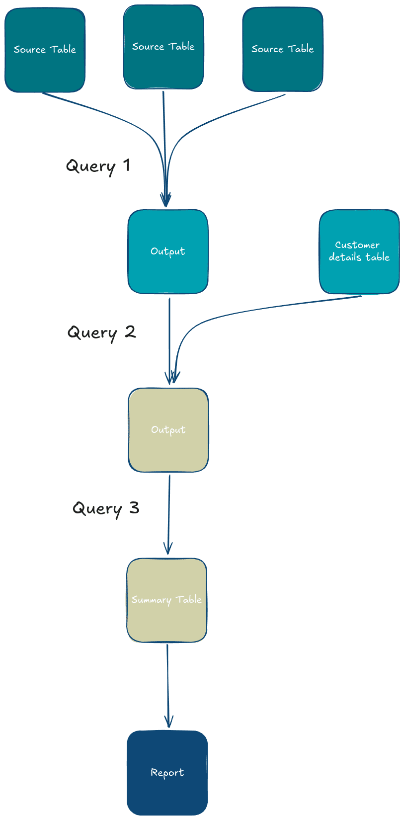
In this pipeline, the results of Step 1 feed into Step 2, and so on. A visualisation of this pipeline would show these steps as boxes connected by arrows, representing how data flows between them and how each query depends on the results of the previous one.
Use Case
Visualising SQL lineage is super useful. It helps with regulatory compliance by tracking data origins and transformations, making it easier to meet standards like GDPR and HIPAA. It also improves data quality and debugging by tracing data through pipelines to find issues quickly. Plus, it ensures that changes to data flows or data sets in a data pipeline don’t disrupt other data flows.
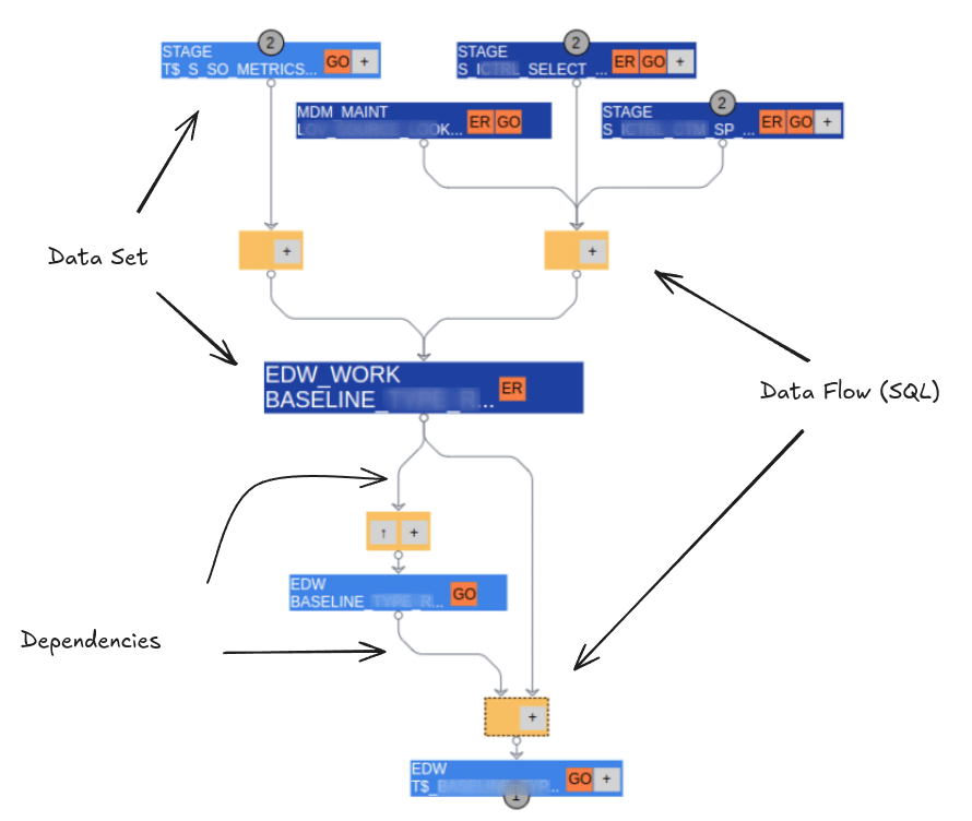
SQL data lineage: Dependencies of data sets and SQL data flows in a data pipeline.
From my experience, data lineage plays a big role in improving data governance. It helps boost accountability by showing exactly who owns what and making sure policies are followed.
I’ve found it’s also a good tool for optimising data pipelines by spotting inefficiencies or bugs you might otherwise miss. When it comes to data pipeline migrations, lineage is useful to understand the data pipeline that needs to be migrated.
Tool
An SQL lineage tool helps organisations to track and visualise the flow of data through systems, pipelines, and transformations, providing insights into the data’s origin, transformations, and destinations.
The tool looks at the history of all the SQL queries that have been run and then creates a visual diagram that shows how these queries are connected or depend on each other.
Visual SQL Query Builder (Drag and Drop)
What is a visual SQL builder or editor?
Visualising SQL query code interprets the SQL code. Visual SQL builders take the opposite route. Instead of coding SQL, users can visually build queries by dragging and dropping tables, selecting columns, and setting conditions through a graphical interface.
With the advent of Generative AI and LLM visual query builders will lose in importance. Users will use text to SQL to create an initial draft of the SQL and then refine the query further.
Example
Think of graphical query builders where users don’t need to know SQL but can construct complex queries by pointing and clicking.
Use Case
Visual query building is helpful for non-technical users or when simplifying complex query building. However, I expect it to be replaced by text to SQL using GenAI.
Visual SQL Query Builder Tools
Visual SQL builders and SQL query editors can be integrated into bigger software packages or be standalone. Some of them are commercial, other visual SQL tools are open source or free.
have come across visual SQL builders in the following type of tools
In ETL tools a visual editor is used to create data mappings and data flows. I have written elsewhere on this website about how these point and click editors reduce productivity and are slower than manually writing code. One of the first ETL tools that let you build SQL visually was Oracle Warehouse Builder.
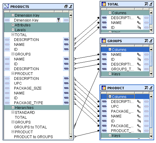
SQL IDEs such as DBeaver.
Some databases ship with visual SQL editors. The first database I worked with was MS Access and I faintly remember that it had some sort of visual SQL builder.
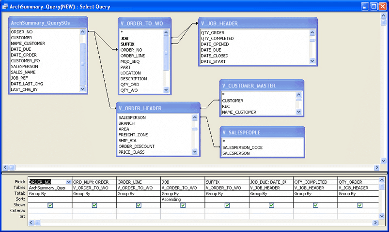
A visual SQL builder in BI tools such as Tableau lets users create SQL queries without writing code by using a drag-and-drop interface to select tables, fields, and conditions. The generated query is then pushed to the database and the result is returned to the BI tool. The first ad-hoc query tool I worked with was Business Objects WebIntelligence (Webi).
Visual SQL aids for SQL learners and beginners
What it means
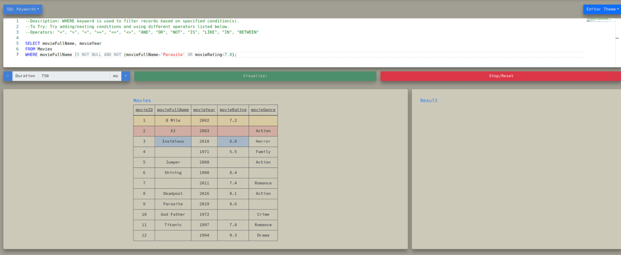
Visual SQL aids break down the SQL query visually. They process the query in stages, showing how different parts of the SQL statement (like SELECT, WHERE, and JOIN clauses) affect the data.
They highlight rows being kept or discarded at each query execution step, making the query’s logic clear.
Example
You can follow a single row from an input table as it is transformed, filtered, and aggregated into the final output.
An alternative approach processes the query row by row and checks each row against conditions, such as those in a WHERE clause. If the condition is TRUE, that row is added to the output.
Use Case
Learn SQL visually
Visual SQL learning tools
I have listed three tools
Visualising Joins in a Query as a Venn Diagram
What it means
Visualising SQL joins in a Venn diagrams is somewhat related to visual aids for learning SQL.
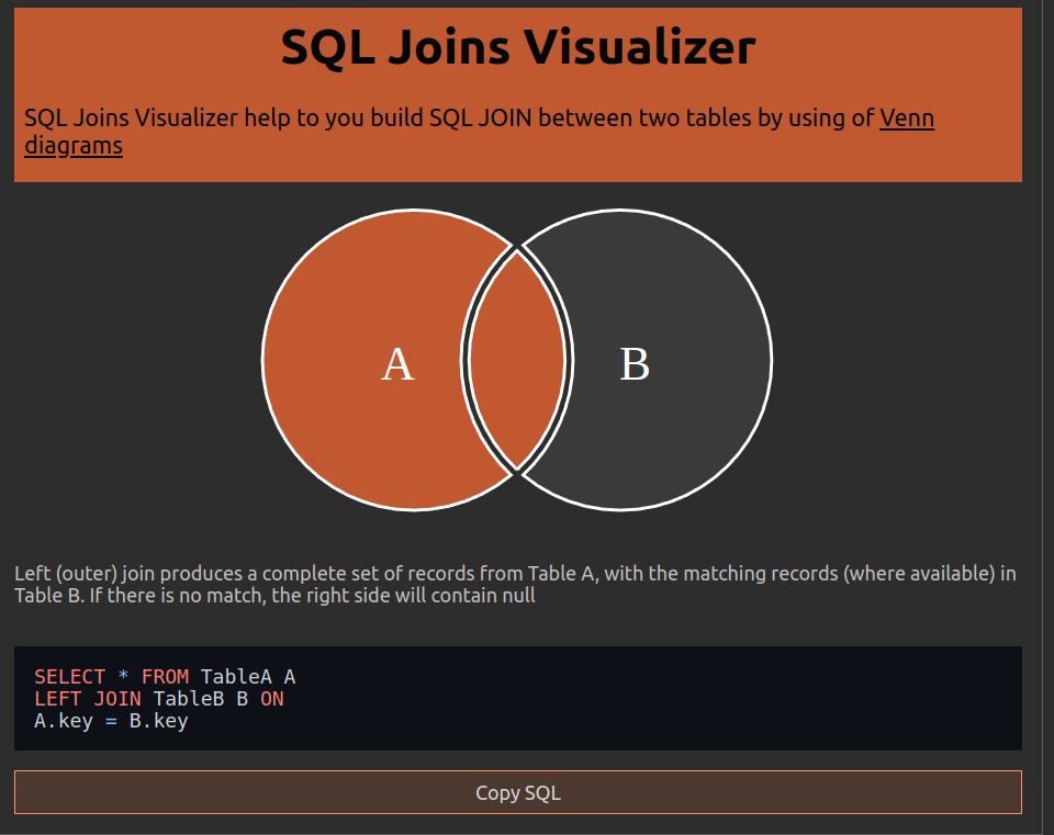
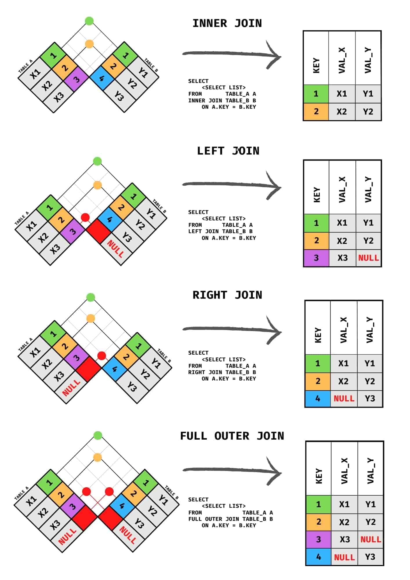
A Venn diagram for SQL joins visually explains the relationships between two or more tables when performing different types of SQL joins (INNER, LEFT, RIGHT, FULL). Each circle in the Venn diagram represents a table, and the overlapping sections show how the join conditions select data from these tables.
INNER JOIN: Shows only the intersection (common data between the table).
LEFT JOIN: Shows all data from the left table, plus the intersection.
RIGHT JOIN: Shows all data from the right table, plus the intersection.
FULL JOIN: Shows all data from both tables, with or without intersection.
Example
SQL Joins Visualiser
An alternative approach is to visualise SQL joins as a chequered flag diagram
Use Case
Helpful for people learning SQL joins or when trying to conceptualise how different tables are merged. It is pretty basic stuff though.
SQL join visualisation tool
The SQL join visualiser translates the Venn diagram to an SQL query.
Visualising the SQL parse tree
What it means
SQL queries can be broken down into an AST (Abstract Syntax Tree), a structured representation of how the query is interpreted by the database.
Example
A visual tool might show the components of an SQL query (SELECT, FROM, WHERE, etc.) in a hierarchical tree format, allowing you to see how the database parses it.
Let’s take a simple SQL example
|
1 |
SELECT name, age FROM employees WHERE age > 30; |
This can be represented as an Abstract Syntax Tree
|
1 2 3 4 5 6 7 8 9 10 11 |
SELECT ├── Columns │ ├── name │ └── age ├── FROM │ └── employees └── WHERE └── Condition ├── Column: age ├── Operator: > └── Value: 30 |
An SQL parser can output this as an XML or JSON tree.
|
1 2 3 4 5 6 7 8 9 10 11 12 13 14 15 16 17 18 19 20 21 22 23 24 25 26 27 |
<?xml version="1.0" encoding="UTF-8"?><parSeQL xmlns:xsi="http://www.w3.org/2001/XMLSchema-instance" version="1.0" status="OK" ts="2024-10-14T07:13:32.390Z" xsi:schemaLocation="https://flowhigh.sonra.io/flowhigh_v1.2.xsd"> <statements> <statement pos="0-46" cluster_top_Hi_ID="-9150035226786510270" cluster_top_Lo_ID="-603914746900942594" cluster_logical_ID="1536843882837981305" cluster_raw_ID="-8046686254704789258"> <ds pos="0-46" type="root" subType="inline"> <out> <attr pos="7-4" oref="C1"/> <attr pos="13-3" oref="C2"/> </out> <in> <ds pos="22-9" oref="T1"/> </in> <filter xsi:type="filtreg"> <op pos="38-8" type="GT"> <attr pos="38-3" oref="C2"/> <const>30</const> </op> </filter> </ds> </statement> </statements> <DBOHier> <dbo oid="T1" type="TABLE" name="EMPLOYEES"> <dbo oid="C1" type="COLUMN" name="NAME"/> <dbo oid="C2" type="COLUMN" name="AGE"/> </dbo> </DBOHier> </parSeQL> |
Parsed SQL output from FlowHigh SQL parser.
Use Case
I have covered the use cases of an SQL parser extensively in a separate post. Here is a quick summary of the main use cases.
- Data Governance: Assisting with data lineage, cataloging, business rule extraction, and security auditing.
- Data Engineering: SQL query formatting, refactoring, performance tuning, and supporting database migrations.
- SQL Code Visualization: Documenting and debugging SQL.
- Audit Logging: Tracking database usage, auditing table and column access.
- Query Optimization: Identifying inefficiencies and automating impact analysis.
- SQL Migration: Supporting cross-dialect SQL conversions.
Tool
SQL Parser FlowHigh SQL parser.
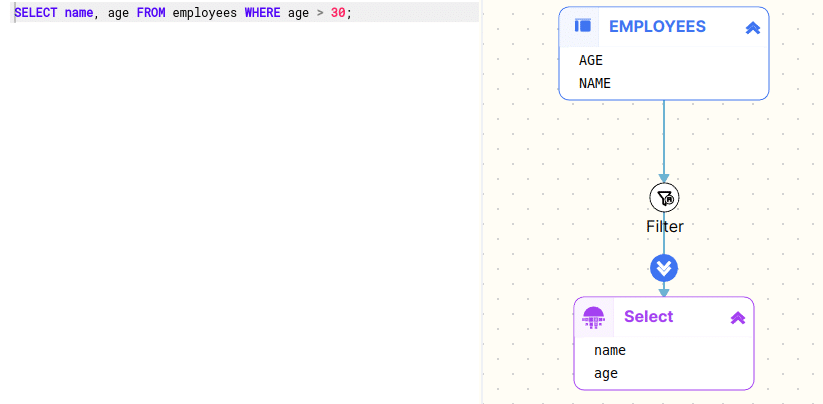
SQL visualisation of the query using FlowHigh SQL Visualiser
SQL Visualisation of Query Output in Charts, Graphs, and Dashboards
What is SQL data visualisation?
Instead of just seeing the raw data you can take the results of an SQL query and visualise the output charts, graphs, and dashboards. This makes the output easier to understand.
Example
Running a query that returns sales data and having the output visualised as a bar chart or pie chart directly.
Use Case SQL visualisation
You can make SQL data easier to understand by turning it into visual charts. Charts help you spot patterns, trends, and issues in your data. They also make it easier to keep an eye on performance metrics over time. With visual data, you and your team can make faster decisions because the information is clearer. Charts help you compare data across different categories or time periods and are a great way to present your findings in reports or meetings.
SQL visualisation tools
SQL data visualisation tools have been around the block for a very long time. The first tool I used was Crystal Reports. It was very clunky compared to the tools of today such as PowerBI or Tableau. The first modern BI tool I used was Web Intelligence (Webi) from Business Objects. This French company popularised many of the innovations around ad hoc querying and semantic layers.
A semantic layer in SQL visualisation acts as an intermediary between the raw data and the end user. It abstracts the complexity of the database, such as SQL tables, joins, or database schemas, and translates them into terms familiar to business users. A BI tool uses the semantic layer and takes what business users do, like choosing filters or options, and turns those actions into SQL queries to get the right data from the database.
Another popular tool I used was Oracle Business Intelligence (OBI). Nowadays, many tools are on the market including open source tools such as Superset.
Visualising Databases – SQL ER Diagrams
What it means: SQL ER diagram
An SQL Entity Relationship Diagram (ERD or ER Diagram) can mean two things. (1) You can create an ER Diagram from the tables in a database schema that visualises the relationships between the tables. (2) You can also go the other way and turn the ER diagram to SQL code.
Breaking Down SQL Subtypes: DDL and Its Role in ER Diagrams
The technically correct term for turning SQL into an ER (Entity-Relationship) diagram is reverse engineering the SQL code. The opposite operation of turning an ER diagram into SQL code is called forward engineering. SQL in the context of reverse and forward engineering is more specifically referring to DDL (Data Defintion Language), DDL defines the structure of the database, including creating tables, defining columns, and setting relationships. This structure can then be converted into an ER diagram.
SQL itself is broader and includes other subtypes like:
DQL (Data Query Language): For querying data.
DML (Data Manipulation Language): For modifying data.
DDL: For defining or altering database structures.
SQL to ER Diagram (Reverse Engineering)
When you go from SQL to an ER diagram visualisation, it’s called reverse engineering. This means taking existing SQL code, which defines the tables and relationships (through DDL), and turning it into a visual ER diagram. This helps you understand how the database is structured.
ER Diagram to SQL (Forward Engineering)
Going from an ER diagram to SQL is called forward engineering. You model the ER diagram in your data modelling tool. Forward engineering generates the necessary SQL code (DDL) to create the database’s tables, columns, and relationships based on the data model diagram.
Example
A tool might generate an ER diagram that shows tables as boxes, with arrows representing relationships (foreign keys) between them.
Use Case
ER diagrams are widely used in database design and documentation to understand the structure of a database at a glance.
The purpose of an ER diagram includes:
- Visualising Database Structure: Clearly shows how tables are related to each other through their Foreign Key constraints.
- Improving Productivity: Allows users to visually model the database, making it faster and easier to design and modify.
- Effective Communication: The ER diagram can be used as an effective communication tool between data engineers, data architects and data modellers.
Data modelling tools for SQL ER diagrams
You create an ER diagram with a data modelling tool. Personally I have used various enterprise level data modelling tools such as PowerDesigner, Erwin or ER Studio. They all do the job but you need to make sure that the database you are using is supported by the tool.
Benefits and use cases of visualising SQL code
We have covered the various meanings of SQL visualisation. Let’s now focus on the main topic of this article and the benefits of creating a visual representation of SQL code in a diagram.
SQL may seem straightforward with its simple syntax and limited set of commands, but it opens the door to creating highly complex queries that can be hard to master. As one of the first declarative languages that engineers learn, SQL presents a challenge—its logic requires a different thought process compared to the more familiar procedural or object-oriented programming paradigms. SQL forces you to focus on what you want from the data, rather than how to get it, which is a significant shift in thinking for many. With SQL, engineers need to think in sets of data rather than procedural steps.
SQL is deceptively simple
The deceptive simplicity of SQL often leads to spaghetti code—an entangled mess of unnecessary nesting, redundant joins, over-reliance on views and incorrect logic. What starts as a straightforward query can quickly snowball into a labyrinth of convoluted code that’s hard to untangle. I’ve collected and documented some of the most common SQL antipatterns, which barely scratch the surface of the problem, yet give a glimpse into how easily things can spiral out of control.
Query reading versus query writing
Query interpretation—deciphering an existing query—is often as challenging as writing a new one. Much like understanding code in any programming language, interpreting a query involves understanding the original author’s logic, making sense of table relationships, and remembering table schemas and aliases. This skill requires a thorough knowledge of SQL and often serves as a testing ground for one’s comprehension of database logic. It’s not just about piecing together lines of code; it’s about reconstructing the original thinking behind them, making it a core part of the development process. Limited error detection and debugging in SQL systems makes writing effective SQL queries even more challenging.
The need for SQL visualisers for AI-generated queries
I have started using Large Language Models (LLMs) to generate SQL “starter code,” but I still need to review the generated queries for accuracy. Some experts predict that, in the future, AI will handle all SQL writing, with humans like us taking on more of a supervisory role. However, understanding and modifying AI-generated queries will remain a key skill. SQL is no exception—reading and interpreting queries can be just as difficult as writing them from scratch.
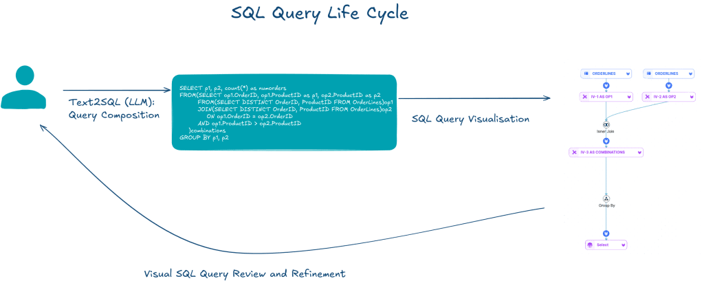
Even though it might be easier to modify a generated query than to write one from the ground up, users still need a solid understanding of the query to make effective changes. Tools help users comprehend written queries. Query visualisation is a promising solution. It makes complex SQL easier to grasp.
SQL visualisers versus Visual SQL query builders
While there has been a lot of research on visual methods for creating queries (often referred to as Visual Query Languages, or VQLs), the task of visualising existing queries poses different challenges. Automatically generating a visual representation of a query is quite different from building a new one from scratch in a visual SQL builder tool.
Query intent
Another issue is query semantics, the actual meaning and intent behind the SQL. Even for experienced developers, reading and understanding SQL queries is often a daunting task, especially when dealing with queries written by someone else. Tasks like code maintenance, modification, or reuse all require deep comprehension of these existing queries.
I’ve pulled together a comprehensive list of all the benefits, use cases, and compelling reasons why you should be visualising your SQL queries.
- Improved Query Comprehension: Complex queries, especially those involving multiple joins, subqueries, or nested operations, can be hard to interpret in raw code form. Visualisations break down the logic, making it easier to understand relationships between tables and operations.
- AI-generated queries: SQL visualisation can help in reviewing and validating SQL generated by LLMs.
- Simplifies Complex Query Interpretation: SQL queries, particularly those written by others or involving nested or correlated subqueries, can be hard to interpret. Visualizing these queries provides users with a clearer understanding, allowing them to focus on the structure and relationships within the query without getting lost in the syntax.
- Assists in Recognizing Query Patterns: Humans are generally better at recognizing patterns visually than parsing them from text. By converting SQL queries into visual forms, users can easily spot familiar patterns, such as joins or subqueries, and understand their relationships.
- Faster Debugging: By representing SQL queries graphically, developers can more easily spot errors, bottlenecks, or inefficiencies in the query logic.
- Better Collaboration: Visual diagrams help teams discuss and collaborate on query design, especially for non-techies.
- Enhanced Performance Tuning: Identifying performance issues, such as redundant joins or expensive operations, becomes easier when queries are visualised, aiding in optimisation efforts.
- Educational Aid: It serves as a great tool for learning SQL, as visualising the operations helps beginners better understand how different SQL clauses interact.
- Reducing Complexity: Large, nested queries can be broken into simpler visual steps.
- Clearer Relationships: Easily spot table relationships and joins between tables.
- Documentation: Visuals provide an intuitive way to document query structures.
- Onboarding: Helps new team members understand existing queries faster. From my own experience this also applies to code I have written in the past. It always amazes and puzzles why I would have written a piece of SQL code the way I did. I always find a way to improve it.
- Bridges the Gap Between Composition and Interpretation: Writing SQL queries is already a challenge, but understanding them—especially when written by others—can be even more difficult. Visualization tools like QueryViz alleviate this problem by simplifying the interpretation process, thus helping users understand the logic behind complex queries more efficiently.
The top methods for visualising SQL
There are different methods and approaches to visualising SQL. Let’s check the most common approaches and the thinking behind them.
Visualise SQL operations as a dataflow diagram
The first time I came across visualisation of SQL code was in the excellent book Data Analysis Using SQL and Excel by Gordon Linoff. The first edition is from 2008, and it’s one of the few physical books I still keep on my shelf, having switched to eBooks many years ago.
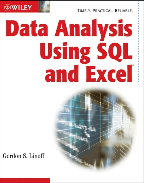
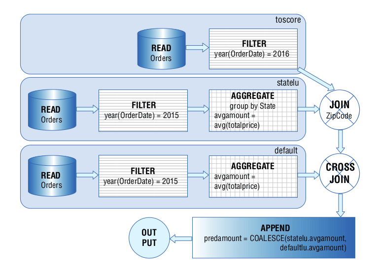
Gordon uses an operator based approach for visualising SQL. This visualisation focuses on SQL operators, highlighting key actions like:
- Joins between tables, which show how data from different tables is combined.
- Set-based operations such as UNION, INTERSECT, or MINUS, which illustrate how datasets are merged or compared.
- Aggregation functions (e.g., SUM, COUNT, AVG), which summarise data across multiple rows or tables.
In his book Gordon connects SQL and Excel to show how they can be used together for data analysis, transformation, and presentation. Though SQL and Excel often perform similar operations, they do so in very different ways. For example, SQL uses GROUP BY to summarise data, while Excel achieves similar results using pivot tables or functions like SUMIF().
To combine these tools, Gordon introduces what he calls dataflows as a common way to express data transformations independent of tooling and technology. A dataflow is a graphical representation showing how data moves and changes, much like an architectural blueprint for data processing. Dataflows consist of nodes (which transform the data) and edges (which represent the pipes through which data flows). As data moves through these pipes, it gets manipulated and transformed, eventually becoming useful information.
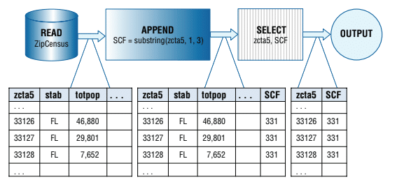
In essence, dataflows provide a visual and tool-independent way to think about how data gets processed, making them a great tool for communicating how data flows across different platforms like SQL and Excel.
Gordon’s approach focuses on the operations of the query (or verbs and actions) as he calls them rather than the structure represented by tables and inline views.
He outlines the following operations that can be used for creating a dataflow diagram:
- READ: Extracts all columns from a database table.
- OUTPUT: Creates output in table or chart format.
- SELECT: Chooses specific columns to pass along.
- FILTER: Filters rows based on conditions.
- APPEND: Adds new calculated columns.
- UNION: Merges multiple datasets into one.
- AGGREGATE: Summarises data by groups.
- LOOKUP: Matches and appends columns from another table.
- CROSSJOIN: Creates Cartesian product of two tables.
- JOIN: Combines two tables by a key.
- SORT: Orders data based on specified keys.
Here is an example from the book. The following SQL statement translates to the dataflow diagram.
|
1 2 3 4 5 6 7 8 9 10 11 12 13 14 15 16 17 |
SELECT toscore.* ,COALESCE(statelu.avgamount ,defaultlu.avgamount) AS predamount FROM (SELECT o.* FROM Orders o WHERE YEAR(o.OrderDate)=2016) toscore LEFT OUTER JOIN (SELECT o.State ,AVG(o.TotalPrice) AS avgamount FROM Orders o WHERE YEAR(o.OrderDate)=2015 GROUP BY o.state) statelu ON o.State=statelu.State CROSS JOIN (SELECT AVG(o.TotalPrice) AS avgamount FROM Orders o WHERE YEAR(o.OrderDate)=2015) defaultlu |
Automating SQL visualisation
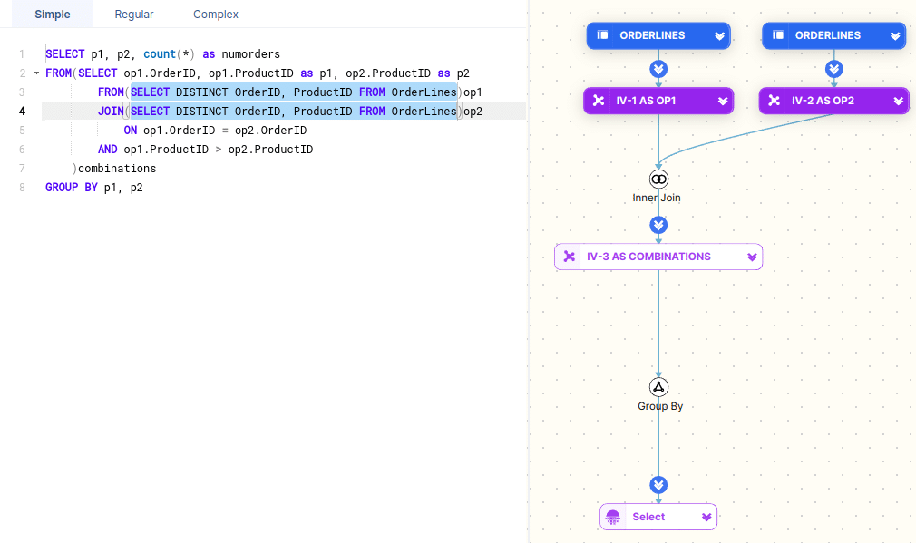
Gordon Linoff uses the proverbial pen and paper to draft up the SQL data flow diagram using Visio or a similar workflow tool. We created FlowHigh SQL Visualiser to automate the process.
Unlocking Query Logic and Intent
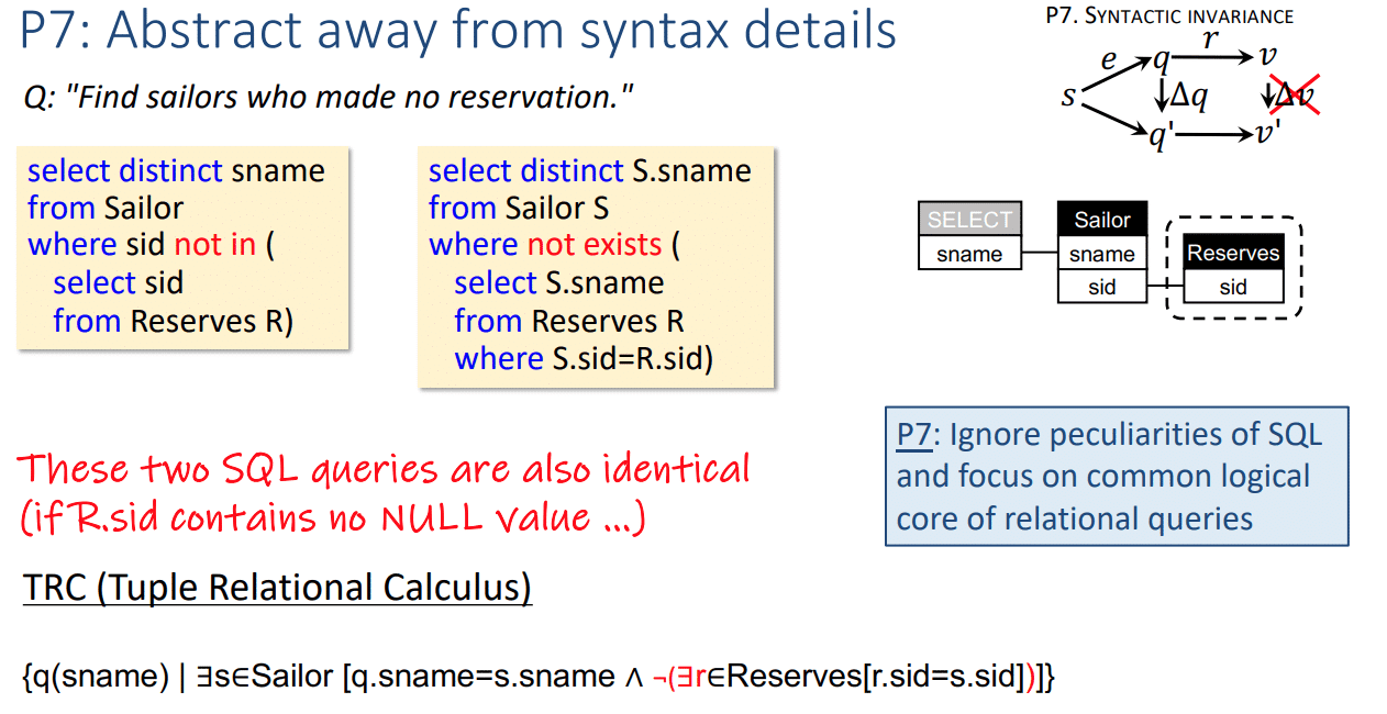
Logic based SQL diagrams are based on the first-order logic (FOL) that underlies SQL. The key idea is that these diagrams capture the logical intent of a query—essentially what the query is trying to do—rather than focusing on the low-level syntax details that make SQL challenging to read. A tool that implements logic based SQL diagrams is QueryVis. QueryVis mainly targets experienced SQL users.
The visualisations in QueryVis are simple, showing only what’s needed, and clear, making sure that queries with different structures but the same semantic meaning are shown in the same way. The QueryVis authors argue that these alternative expressions often complicate the process of interpreting the query, even when their underlying logic is the same.
As long as the patterns are the same they abstract away from syntax details and the following queries would be represented visually the same
Visual Query Representation Tutorial
QueryVis video
SQLVis helps with query writing
Unlike QueryVis, which focuses on understanding existing SQL queries and targets experienced users, SQLVis is designed to help SQL learners write new queries. SQLVis uses a method called Visual Query Representations (VQR), which shows SQL queries in a visual format and shows the actual SQL code side by side with the query. This approach helps learners better understand how SQL works and makes it easier for them to write accurate and reusable SQL queries.
SQL queries in plain English
When it comes to SQL, most research focuses on using AI to generate SQL code. However, LLMs and GenAI can also be used to describe the intent of an SQL query.
Rather than being an alternative to SQL query visualisation, textual explanations of SQL can complement the visual aid of SQL visualisers when interpreting SQL and understanding the meaning of SQL code.
Current limitations as of October 2024 are that LLMs produce long sentences, are limited to simple SQL queries, and that textual descriptions do not readily reveal common logical patterns behind queries.
SQL Visualiser Flowhigh
We have gone through a lot of theory and concepts. Let’s see Sonra’s FlowHigh SQL Visualiser in action. FlowHigh is an online SQL query visualiser.
Let’s start with a simple piece of SQL with a couple of CTEs and some nesting.
|
1 2 3 4 5 6 7 8 9 10 11 12 13 14 15 16 17 18 19 20 21 22 23 24 25 26 |
WITH f_customer_sales AS ( SELECT fs.OrderDateKey ,fs.ProductKey ,fs.OrderQuantity*fs.UnitPrice AS TotalSale ,dc.FirstName ,dc.LastName FROM FactInternetSales fs INNER JOIN DimCustomer dc ON dc.CustomerKey=fs.CustomerKey) ,d_date AS ( SELECT DateKey ,CalendarYear FROM DimDate WHERE CalendarYear=2017) SELECT CalendarYear ,ProductKey ,SUM(TotalSale) AS TotalSales FROM f_customer_sales INNER JOIN d_date ON d_date.DateKey=f_customer_sales.OrderDateKey GROUP BY CalendarYear ,ProductKey ORDER BY CalendarYear ASC ,TotalSales DESC |
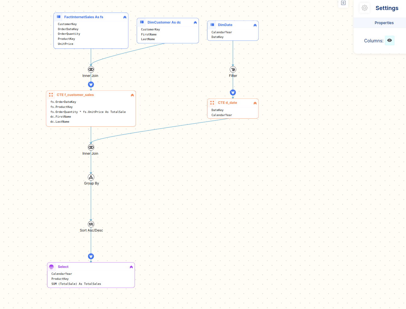
Let’s have a look at the visual diagram that FlowHigh Visualiser generates
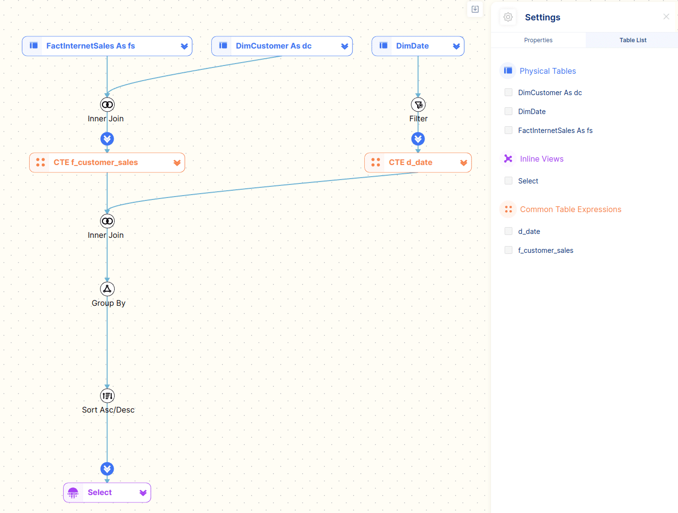
Using the visual diagram of the SQL code we can quickly see that it breaks down into two CTEs.
- The first CTE f_customer_sales joins the tables FactInternetSales and DimCustomer together.
- The second CTE d_date queries the table DimDate and applies a filter on the CalendarYear field.
The two CTEs are then joined and an aggregation is applied. In a final step the resultset is sorted and returned to the user.
Table types
For representing SQL code we have come up with a categorisation for tables.
Each different type gets its own symbol and colour.
Let’s go through them one by one
Physical table
A physical table is a standard table where the data is persisted and has been created with the CREATE TABLE DDL statement.
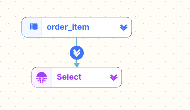
The following query references a physical table
|
1 2 3 |
SELECT col1 ,col2 FROM order_item |
… and the representation by FlowHigh on the diagram.
Pseudo table
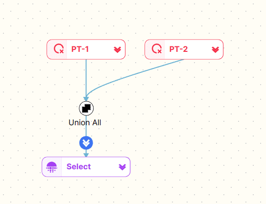
Pseudo tables are tables that are created on the fly by hard coding values.
An example
|
1 2 3 |
SELECT CAST('2021-05-24' AS DATE) AS QueryDate UNION ALL SELECT CAST('2021-05-25' AS DATE) AS QueryDate |
Common Table Expressions (CTE)
We have already seen CTEs in action in our first example. CTEs are reusable snippets of SQL that can be nested and referenced in other components of the same SQL statement.
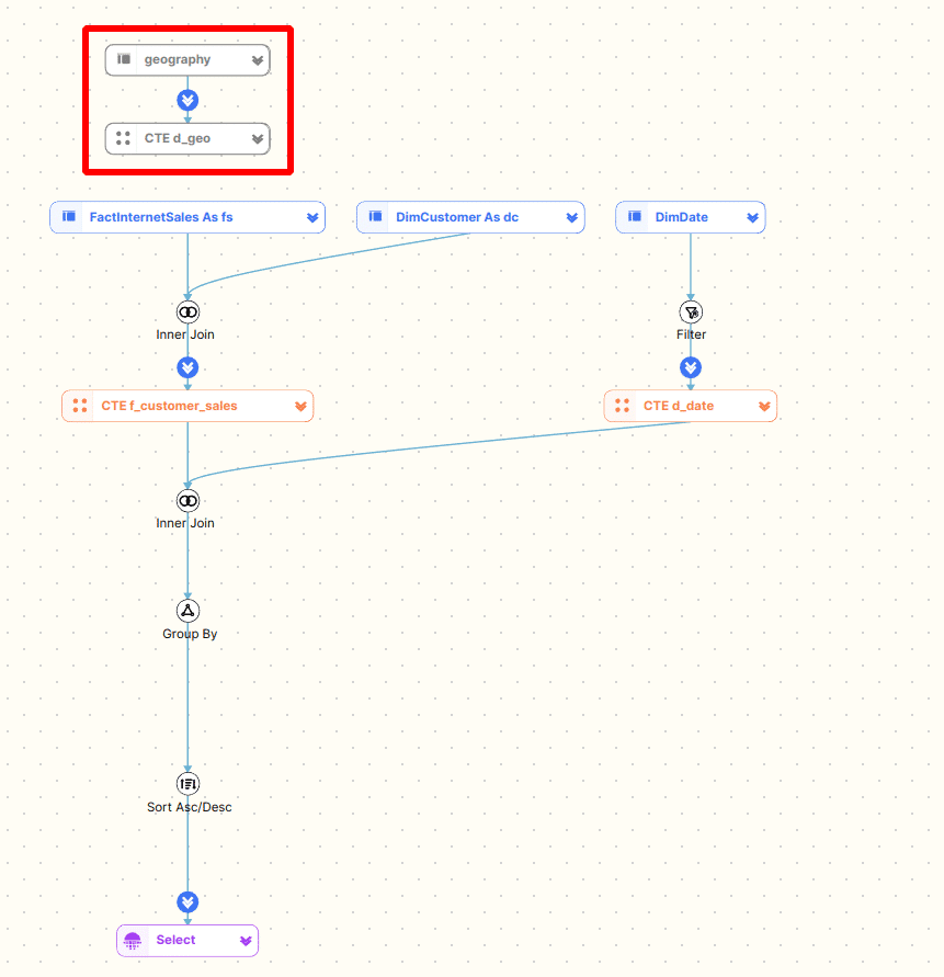
There is one CTE visualisation feature I did not mention. Sometimes developers write a CTE and then don’t use it.
Here is an example
|
1 2 3 4 5 6 7 8 9 10 11 12 13 14 15 16 17 18 19 20 21 22 23 24 25 26 27 28 29 |
WITH f_customer_sales AS ( SELECT fs.OrderDateKey ,fs.ProductKey ,fs.OrderQuantity*fs.UnitPrice AS TotalSale ,dc.FirstName ,dc.LastName FROM FactInternetSales fs INNER JOIN DimCustomer dc ON dc.CustomerKey=fs.CustomerKey) ,d_date AS ( SELECT DateKey ,CalendarYear FROM DimDate WHERE CalendarYear=2017) ,d_geo AS ( SELECT geo_nm FROM geography) SELECT CalendarYear ,ProductKey ,SUM(TotalSale) AS TotalSales FROM f_customer_sales INNER JOIN d_date ON d_date.DateKey=f_customer_sales.OrderDateKey GROUP BY CalendarYear ,ProductKey ORDER BY CalendarYear ASC ,TotalSales DESC |
We have added a third CTE d_geo to the SQL. However, this is not referenced anywhere else.
We can see that this results in an orphaned component on the diagram which is not connected to any other parts of the SQL. We also grey this out on the diagram.
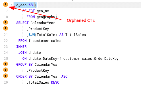
This will also be detected by the FlowHigh Analyser as an SQL anti pattern.
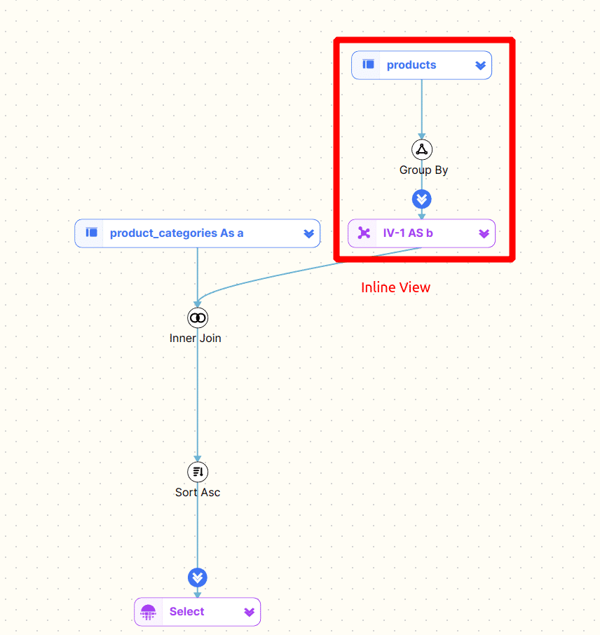
Inline view
Inline views are similar to CTEs. They can both be nested. One of the differences is that CTEs are reusable and multiple instances can be referenced inside the same SQL statement.
|
1 2 3 4 5 6 7 8 9 |
SELECT category_name ,max_list_price FROM product_categories a JOIN(SELECT category_id ,MAX( list_price) max_list_price FROM products GROUP BYcategory_id) b ON a.category_id=b.category_id ORDER BYcategory_name; |
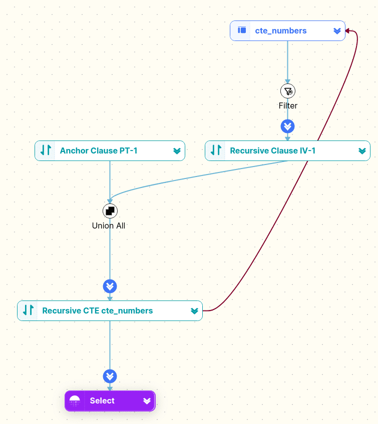
Recursive CTE
Recursive CTEs traverse a hierarchy. Here is an example
|
1 2 3 4 5 6 7 8 9 10 11 12 13 |
WITH cte_numbers(n ,weekday)AS ( SELECT0 ,DATENAME(DW ,0) UNION ALL SELECT n+1 ,DATENAME(DW ,n+1) FROM cte_numbers WHERE n<6) SELECT weekday FROM cte_numbers; |
The diagram shows the anchor and recursive clause. For a great explanation on how recursive CTEs work check this blog post Understanding Recursive CTEs.
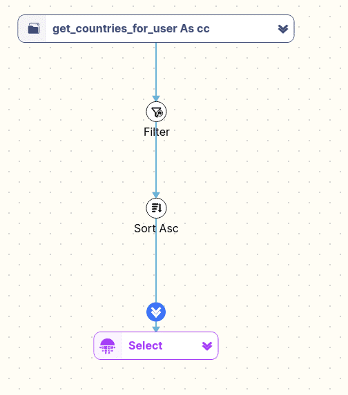
Function table
Some databases and SQL dialects offer User Defined Table Functions (UDTF).
Here is an example for a UDTF
|
1 2 3 4 5 6 |
SELECT * FROM TABLE(get_countries_for_user(123)) cc WHERE cc.country_code IN ('US' ,'FR' ,'CA') ORDER BY country_code; |
And how FlowHigh displays a UDTF in the diagram
Browsing and searching SQL
You can browse the diagram
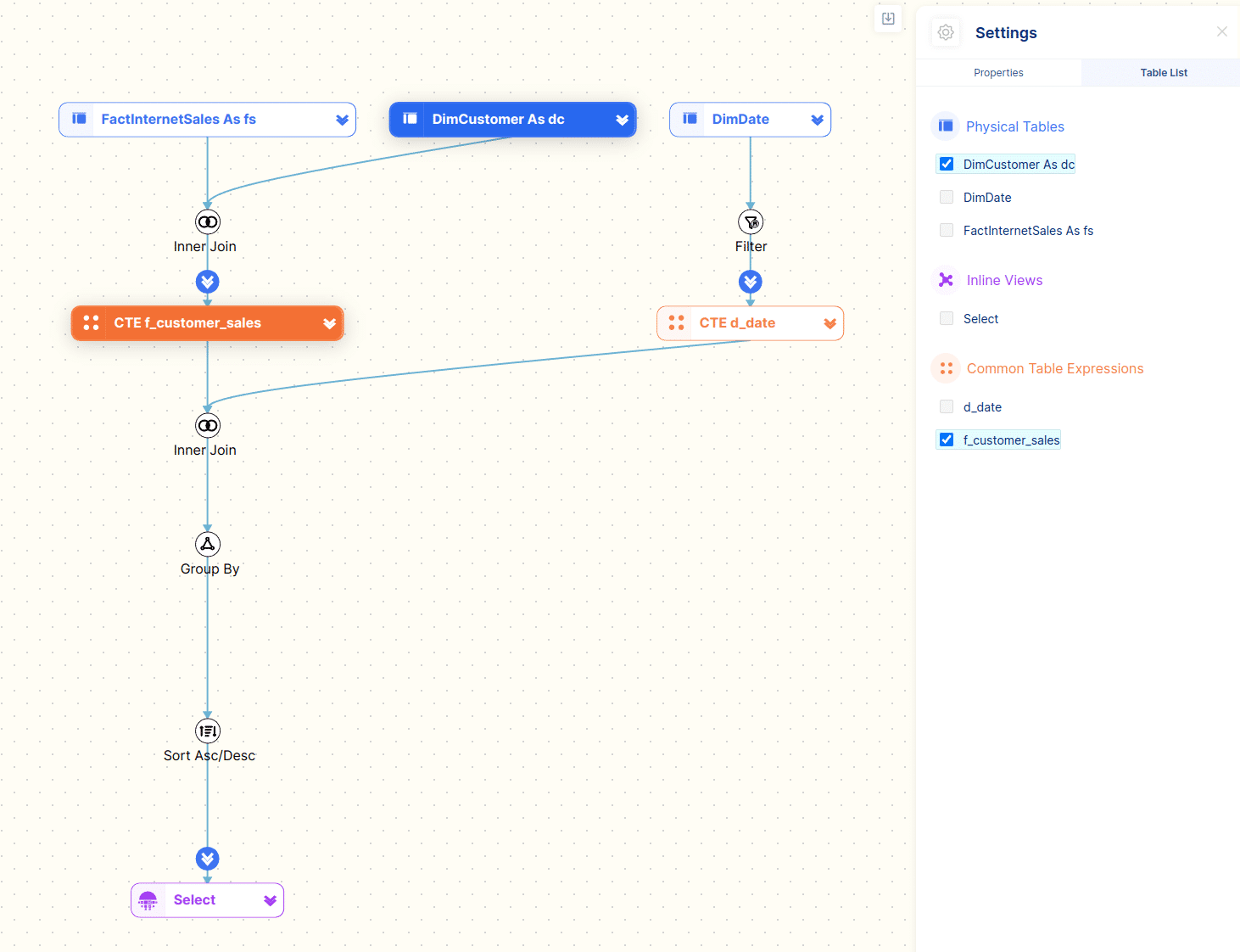
You can find tables by browsing and selecting tables from the Table List. This is very useful if you need to quickly find a table in a very large and complex SQL statement with many subqueries and table joins.
In the figure below we have selected the DimCutsomer table and the f_customer_sales CTE. They are highlighted on the diagram.
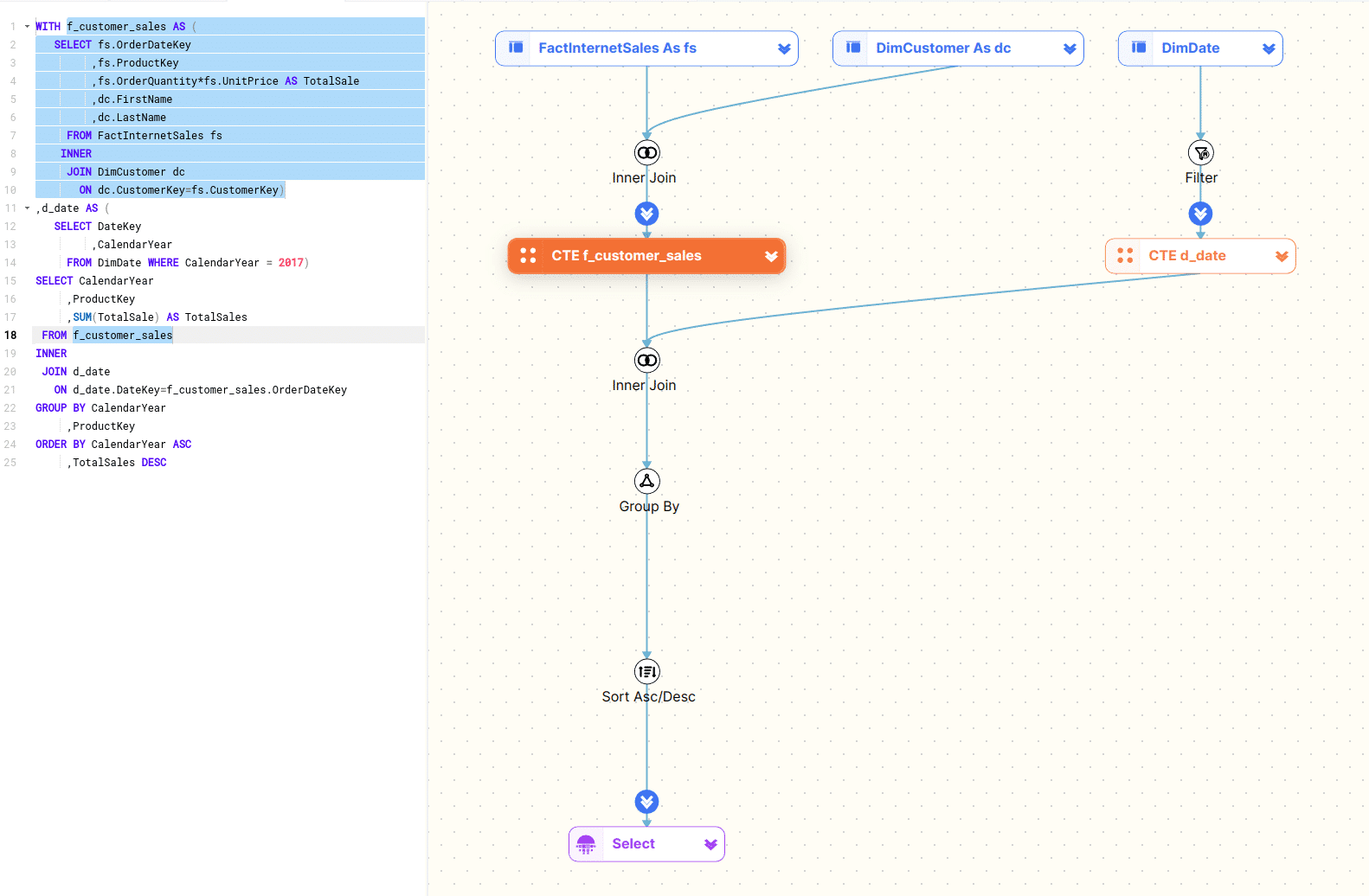
You can also browse the diagram itself and select tables which will then highlight the corresponding part of the SQL code.
In the figure below we have selected the f_customer_sales CTE. This will highlight the definition of the CTE and also any instances of the CTE.
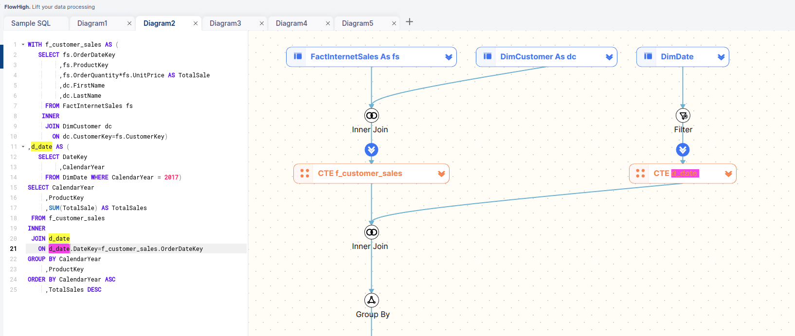
We search for the d_date CTE and results are highlighted in the editor and the diagram
Navigating the SQL visualisation
Expand and collapse
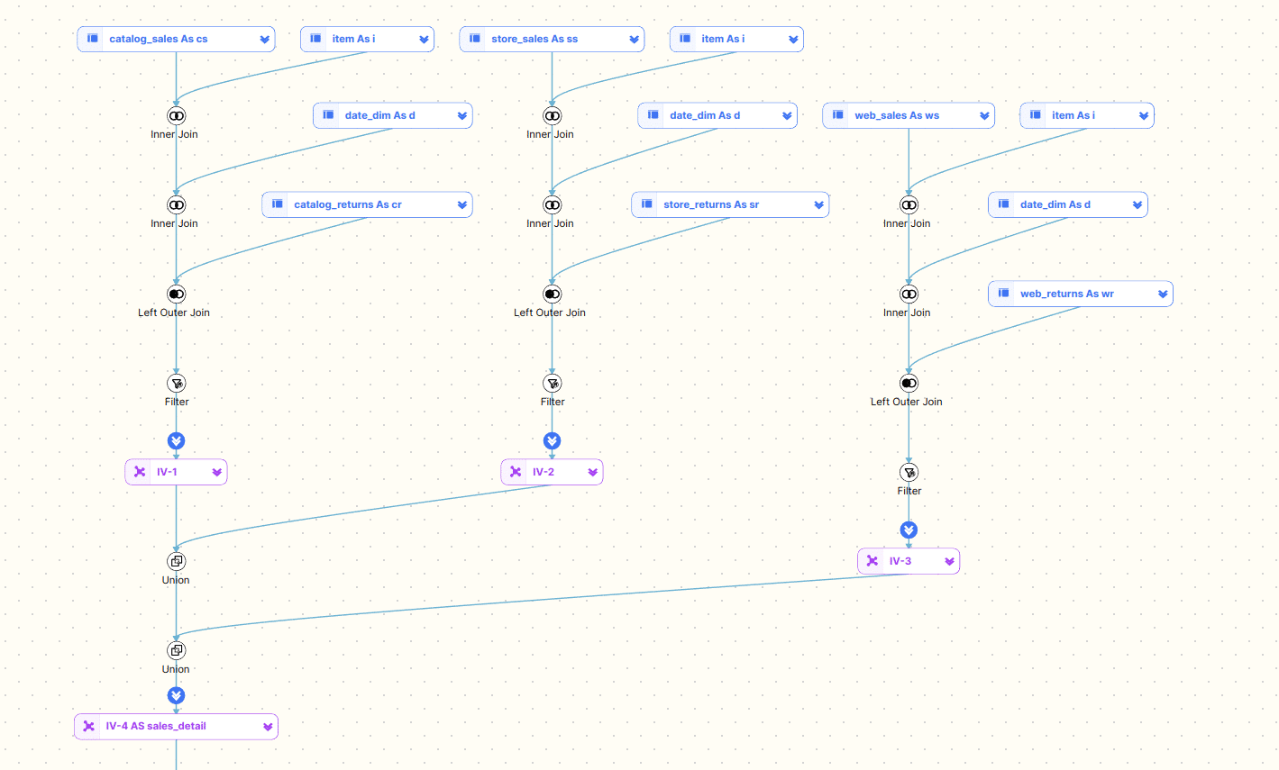
You can collapse and also expand any CTEs and Inline Views. This is useful to drill down into the SQL hierarchy and nest or unnest any lower or higher level parts of the SQL.
Let’s collapse both CTEs to focus on the top level tables that make up our SQL.
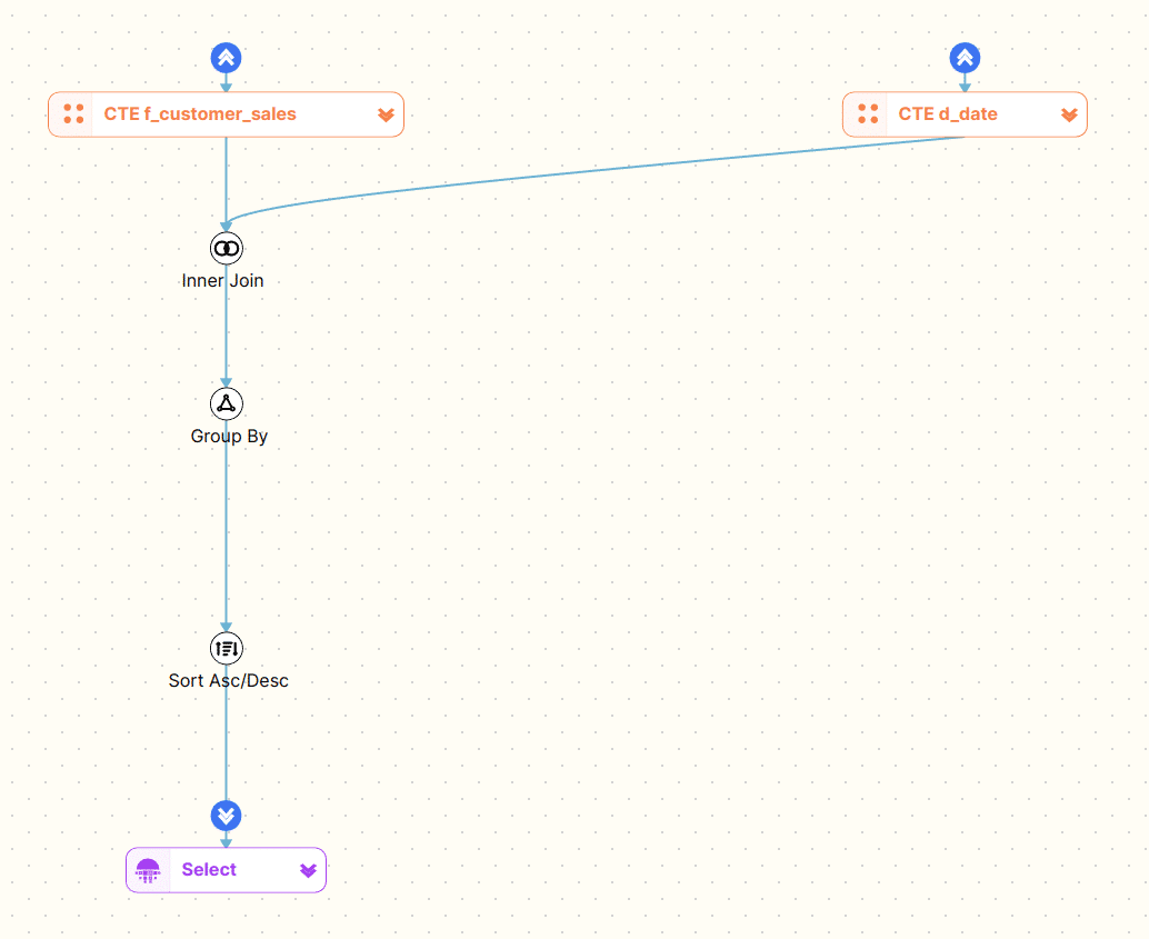
We can now drill further into our code one CTE at a time
The same expand and collapse functionality also exists for the SQL code editor. We can also expand and collapse and inline views or CTEs.
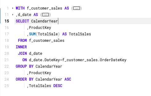
This drill down feature particularly useful for deeply nested and complex SQL
Level 1
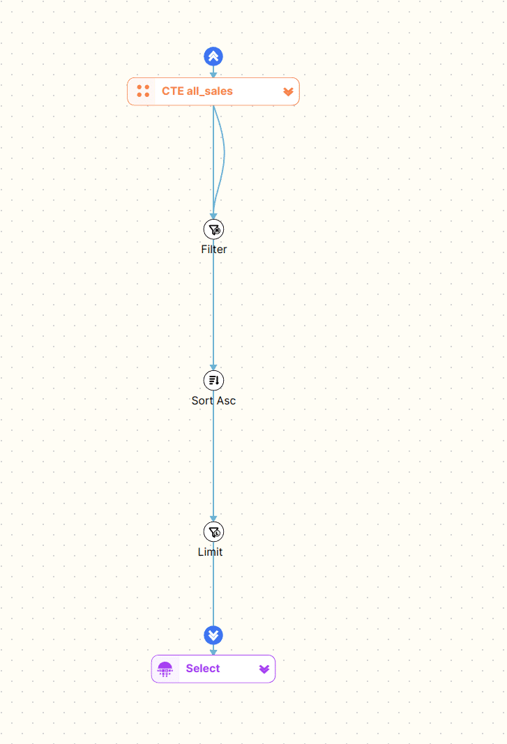
Level 2
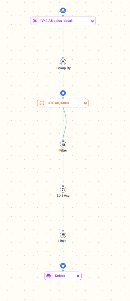
Level 3
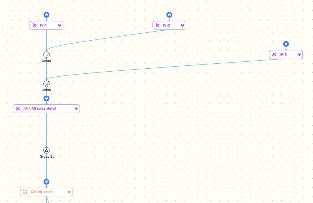
Level 4
Columns
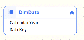
You can also view column level detail
Hover over a table
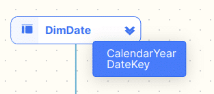
…or an operator

Expand a table
Expand all tables
Other features
Export and download SQL diagram
You can also download the SQL diagram as a PNG to use in your documentation.
Zoom
You can zoom in and out of a diagram by using your mouse wheel or the zoom feature in the bottom right corner of the diagram

FAQs
SQL is structured hierarchically as a tree with different levels of nesting and relationships. The tables and operators (WHERE, GROUP BY etc.) can be represented as nodes and the dependencies between them as edges on a graph.
Yes, SQL can be visualised in several ways to help users better understand complex queries and data relationships. Some common methods of visualising SQL include:
Query Diagrams: Visual representations of SQL queries, showing how tables are joined, the relationships between them, and which fields are selected.
Yes. Snowflake is a popular data platform for data analytics and AI. It has very strong support for SQL. You can create lineage and visualise Snowflake SQL the same way that you can visualise SQL from any other SQL database.
You can use SQL to create data visualisations like charts, graphs, and dashboards by querying the database to retrieve specific data. SQL allows you to filter, group, and aggregate data, which is then passed to a visualisation tool such as Tableau, Power BI. Data engineers and data scientists use SQL in notebooks such as Jupyter Notebook to create charts and data visualisations. These tools take the results of your SQL queries and turn them into visual formats like bar charts, pie charts, line graphs, and dashboards that make it easier to understand trends, patterns, and insights from the data.
For example, you can use SQL to calculate total sales by region, and then a visualisation tool can display that data as a bar chart or pie chart. SQL gives you control over what data to include in the visualisation, while the visualisation tools handle presenting that data in a user-friendly, graphical format.
You can visualise SQL manually using pen and paper or a diagramming tool such as Visio or Excalidraw (my recommendation). You will need to analyse the structure of the SQL query code. Alternatively you can automate the approach by using an SQL Visualiser tool such as FlowHigh. The automated approach automatically analyses the structure of the SQL query using an SQL parser. The parser creates an AST tree that then can be used to visualise the structure of the SQL query.
Further reading
Errors and Complications in SQL Query Formulation
QueryVis: Logic-based diagrams help users understand complicated SQL queries faster
QueryVis Demo
A Tutorial on Visual Representations of Relational Queries
Visual Representations of Relational Queries
SQLVis


